
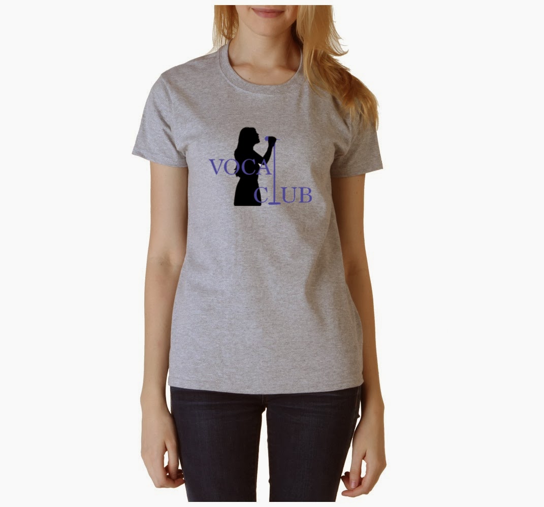
1. How does your logo design represent the after school club or activity?
My logo design represents the after school club by showing unity through the mic stand traveling through the text, acting as an "L" for the word "Vocal" and "Club." In addition, this design expresses that people will be singing and not be judged by their voice. By only seeing the woman's silhouette, it makes the person anonymous.
2. Which process was most helpful in creating your design?
The process that was most helpful was when we had to observe a power point about mixed logos. When there would be text and a picture in the logo, but just enough to make the logo appealing and understandable.
3. What was the most challenging aspect about the logo project?
The most challenging aspect about this project was taking different pictures, texts, and using the Gimp tools to create a cohesive and appealing logo. I had to merge different pictures together and add on to it, as well as, frame it around the text. I am still learning Gimp, but I am slowly getting the hang of how to best utilize the tools offered.
4. Are you satisfied with your final design? Why is your logo successful? If you are not satisfied with your design, what would you like to change?
I am satisfied with my design because I was able to incorporate everything that I wanted. This logo is successful because it shows that people are singing with other people. The "L" shows the unity between the singers and express the non-judgement place with the silhouette. In addition, this is successful because it is simple enough that anyone could understand it and its detailed enough. Also the font works with the part that I drew in, which was the mic stand because they both have serifs.
I saw your logo. And I really likes your logo. I could tell that this is a vocal club
ReplyDeleteI like the way the microphone is in place of the letter l and i like the way it looks on a shirt
ReplyDeleteI like that you chose a simple design and it was clear what the club was. It's creative that you used the microphone stand as the L in both words, and the colors go really well together.
ReplyDeleteI like that the text and graphic interact, it makes for a really cohesive design. Nice job!
ReplyDeleteyeah, i also liked what you did with the L, it is very cool. And did you draw the person? It looks very nice
ReplyDeleteI thought it was a really cool idea that you substituted the "l" with a microphone since it made the logo more unified.
ReplyDeleteI really like your design Ella. It is simple but at the same time very creative by just making the L into a microphone.The color gives it a sense of girliness, so I am guessing that the club mostly has girls. Great design :)
ReplyDeleteI really like your logo design, especially how you used the mike stand as an "L" for both words.
ReplyDeleteI love your logo design. I find it very special how you chose to have the person be the background, so they didn't take too much focus off the design. Well done!
ReplyDeleteYour logo design looks so professional! I love how you made the letter "l" into a microphone.
ReplyDeleteI like your design very much. Turning the "L" into a mic is very creative. One thing that I have to say is that the color of the word bends in with the person too much when it is print out onto paper (your presentation board).
ReplyDeleteI really like how you made the L in the word become a microphone.
ReplyDeleteI really liked how you connect the two words with the L and also you made it look like a microphone stand. That's very creative.
ReplyDeleteAlong these lines, this demonstrates you don't have to simply consider making a confused logo. logo design service
ReplyDelete