1) You were required to create a structure/layout, original title/type, and a visual sequence for your "How To" Poster. Select ONE component you feel your poster is strongest in. Explain why you feel your poster is particularly strong in that category describing at least ONE specific part of your poster.
I think that my poster is strongest in the layout because I made it so that it did not need numbers or descriptions to make it understandable. The layout was in a circle, creating unity and a path for the viewer to follow. This also includes the title, which is where the reader should start and at that time would also notice the espresso beans. The espresso beans in the title went to the espresso bean pile, then to the grinder, and lastly to the espresso filter attachment. In the end, you see the espresso at the machine and the process starts all over again.
2) What is ONE thing you would do differently if you had the chance to start this project over from the beginning? Explain what you do differently and how that would strengthen your poster.
One thing that I would do differently is I would do more on GIMP instead of hand drawing everything. Although it looks nice, it was a ton of work to scan everything and edit it on GIMP. I could have come out cleaner if I used GIMP more. This would strengthen the credibility of the poster because no one would be able to see that it was edited on a different medium. Also if you look closely there are tiny bits of white between the color and the black line, which could have been avoided if everything was done on GIMP.
Saturday, June 7, 2014
Sunday, March 16, 2014
Book Cover Project

This cover is supposed to look like a missing person sign. This cover shows the dark side of people, while keeping the person missing kind of anonymous. The author of this story wanted the cover to be disturbing and red color.
The main focus of my design was to have someone looking worried and scared. Then I would blur out their eyes and hide some of their facial features to make it creepy. The main focus was mastering the missing sign.
The font and font size both relate to the story because the tile "Missing" is bolded and in all caps to give the urgency of the message. The name of the author is in all lowercase because that is not the main focus of the cover, it should be the afterthought. The back cover is the same way. I bolded and capitalized the title and kept the blurb in the middle to make it as though it was an obituary or poem about someone who died. I chose the font to be Helvetica because that is the most neutral font and this story is the exact opposite. I really wanted that contrast to add to the creepy and disturbing-ness of the story.
Thursday, February 6, 2014
Favorite Book Covers from The Book Cover Archive

This book cover is really unique because it plays up the different colors that a room would have if there was actually one light lit. Also the fact that everything is centered really brings it all together into a cohesive cover.

I really liked this cover because the picture explains everything. Nelson Mandela's biography does not even need a title because everyone knows what he looks like. Also the book cover does include the title and author, but in the lower right hand corner, which gives it a professional look.

This cover is really interesting because it first hypnotizes you, then you start to focus on the center, where there is a outline of a profile of a man. This cover really fits with the title because art can be expressed in different ways to represent different things.

I really liked this book cover because it actually looks like someone had slept in the bed and had either left it or was taken from the bed. The way all the sheets are crinkled makes it look realistic.

This cover shows a lot of different types of whales, which the book is obviously about. Also the title is centered between the whales and in the center of the paper. The other information is kind of an after-thought.
Wednesday, February 5, 2014
Best Book Cover

This is the best book cover because it explains what is happening. There are silhouettes of men and women which you would see used in signs for the bathroom. The images are very easy to understand, making it universal and appealing to many audiences. This is a successful cover that explains everything in the cover. This is explaining that there is a crime that has happened because there is a "Do Not Cross" sign across the cover and many outlines of people, which is what happens when someone dies at a scene.
Process of Design Competition

In order to create this cover for the student handbook, I had to think of different ideas for the background. I had thought that it would be interesting to have the background be red and contain a phoenix, representing MHS school colors. This would also represent the school mascot and provide spirt when students would look at it. Also the font that I chose for the name of our high school is the one that we usually use on our t-shirts and sweatshirts. Lastly, the font for the student handbook 2014-2015 label was just chosen at random and the only thing I took into consideration was how it looked with the rest of the page. The name of the school is centered because it is the main attraction and the other label is on the left because that is usually where we line our text up.
Thursday, January 23, 2014
Logo Project Reflection

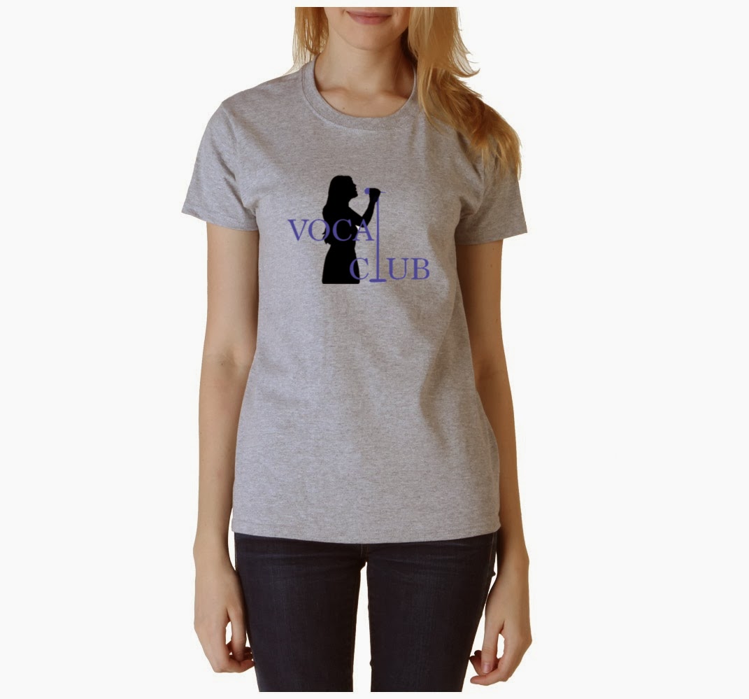
1. How does your logo design represent the after school club or activity?
My logo design represents the after school club by showing unity through the mic stand traveling through the text, acting as an "L" for the word "Vocal" and "Club." In addition, this design expresses that people will be singing and not be judged by their voice. By only seeing the woman's silhouette, it makes the person anonymous.
2. Which process was most helpful in creating your design?
The process that was most helpful was when we had to observe a power point about mixed logos. When there would be text and a picture in the logo, but just enough to make the logo appealing and understandable.
3. What was the most challenging aspect about the logo project?
The most challenging aspect about this project was taking different pictures, texts, and using the Gimp tools to create a cohesive and appealing logo. I had to merge different pictures together and add on to it, as well as, frame it around the text. I am still learning Gimp, but I am slowly getting the hang of how to best utilize the tools offered.
4. Are you satisfied with your final design? Why is your logo successful? If you are not satisfied with your design, what would you like to change?
I am satisfied with my design because I was able to incorporate everything that I wanted. This logo is successful because it shows that people are singing with other people. The "L" shows the unity between the singers and express the non-judgement place with the silhouette. In addition, this is successful because it is simple enough that anyone could understand it and its detailed enough. Also the font works with the part that I drew in, which was the mic stand because they both have serifs.
Tuesday, January 14, 2014
Best of the Best…Memories in 2013!!!!
1. Spending the summer at NYU

2. Taking college courses at NYU for college credit
3. Meeting so many new people from all around the world at NYU
4. Going to San Francisco with my Dad

5. Went on many college road trips with my parents
6. Spending my 17th birthday with my friends
7. Was able to continue learning Mandarin
8. Going to a few concerts before senior year started


9. Being nominated for the Posse scholarship
10. Being apart of the senior kick-off video
11. Got all my college stuff done before Thanksgiving Break
12. Getting into my favorite/dream college and accepting!


13. Enjoying my last year at MHS and looking forward to all the fun activities, senior trip, prom, and graduation!
Subscribe to:
Comments (Atom)